Modernism
Modernism started in the beginning of the 20th Century. It led to certain developments such as the International Typographie style in Switzerland and Corporate Identity in America after the 50's.
The term modern is referred to a period from the 1860's till the 1970's. Modernism combines functionalism and rationalism.
The term modern is referred to a period from the 1860's till the 1970's. Modernism combines functionalism and rationalism.
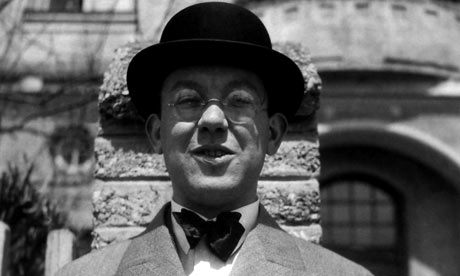
Jan Tschichold
He was born in 1902. His first career was a calligrapher for advertisements. Jan was one of the influences in the 20th Century of Typography. He started to work on typography at an early age.
He was born in 1902. His first career was a calligrapher for advertisements. Jan was one of the influences in the 20th Century of Typography. He started to work on typography at an early age.
His new typography included sans-serif which used Blackletter. He was a typographer, book and typeface designer and writer. He will apply the developments of the Bauhaus printers, typesetters and designers.
He published a book called The New Typography. In this book, he emphasized the importance of: asymmetry, sans-serif type, reduction of form to basic geometry, preference for single case and the use of photographs and illustrations.
Piet Zwart
He was an artist and a designer. He was named after a dutch designer. He was a photographer, typographer, industrial designer and critic. At the age of 36, he produced his first typographic work. He likes the ideas that Theo van Doesburg and De Stijl had.

This work above was influenced by El Lissitzky’s “About 2 Squares” which had been published by Van Doesburg in 1922. The letter N is used for the 3 words. In the 1920's, Zwart experimented with typography and he didn't know about the methods and te difference between lower and upper case. In 1926 he did his first integrated image with 2D and 3D.
He first worked with commercial photographers but then he did his own photographies. His photographic techniques were: repetition, balance, lines and detail. When he designed the book, "TT," he wanted it to have bright colours.

Modernism - Literature Periods & Movements. 2014. Modernism - Literature Periods & Movements. [ONLINE] Available at: http://www.online-literature.com/periods/modernism.php. [Accessed 09 November 2014].
Jan Tschichold : Design Is History. 2014. Jan Tschichold : Design Is History. [ONLINE] Available at: http://www.designishistory.com/1920/jan-tschichold/. [Accessed 09 November 2014].
Richard Hollis: the brilliance of typographer Jan Tschichold | Art and design | theguardian.com . 2014. Richard Hollis: the brilliance of typographer Jan Tschichold | Art and design | theguardian.com . [ONLINE] Available at: http://www.theguardian.com/artanddesign/2008/dec/05/jan-tschichold-typography. [Accessed 09 November 2014].
Piet Zwart - iconofgraphics.com. 2014. Piet Zwart - iconofgraphics.com. [ONLINE] Available at: http://www.iconofgraphics.com/piet-zwart/. [Accessed 18 November 2014].
No comments:
Post a Comment