Tuesday, 18 November 2014

Modernism

Modernism

Modernism started in the beginning of the 20th Century. It led to certain developments such as the International Typographie style in Switzerland and Corporate Identity in America after the 50's.

The term modern is referred to a period from the 1860's till the 1970's. Modernism combines functionalism and rationalism.

Jan Tschichold

He was born in 1902. His first career was a calligrapher for advertisements. Jan was one of the influences in the 20th Century of Typography. He started to work on typography at an early age.


His new typography included sans-serif which used Blackletter. He was a typographer, book and typeface designer and writer. He will apply the developments of the Bauhaus printers, typesetters and designers.
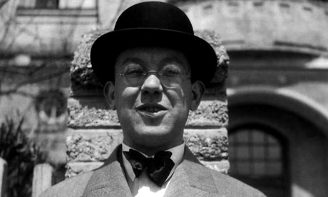


Jan Tschichold

He was a propagandist for the new movement in typography. Jan used geometrical elements for his everyday job and for cinema posters. He moved to Switzerland due to pressure from the Nazis in 1928.

He published a book called The New Typography. In this book, he emphasized the importance of: asymmetry, sans-serif type, reduction of form to basic geometry, preference for single case and the use of photographs and illustrations.

Isotype is a picture method of presenting linked information a word language without words.


Piet Zwart

He was an artist and a designer. He was named after a dutch designer. He was a photographer, typographer, industrial designer and critic. At the age of 36, he produced his first typographic work. He likes the ideas that Theo van Doesburg and De Stijl had.


This work above was influenced by El Lissitzky’s “About 2 Squares” which had been published by Van Doesburg in 1922. The letter N is used for the 3 words. In the 1920's, Zwart experimented with typography and he didn't know about the methods and te difference between lower and upper case. In 1926 he did his first integrated image with 2D and 3D.

He first worked with commercial photographers but then he did his own photographies. His photographic techniques were: repetition, balance, lines and detail. When he designed the book, "TT," he wanted it to have bright colours.


Bibliography:

Modernism - Literature Periods & Movements. 2014. Modernism - Literature Periods & Movements. [ONLINE] Available at: http://www.online-literature.com/periods/modernism.php. [Accessed 09 November 2014].


Jan Tschichold : Design Is History. 2014. Jan Tschichold : Design Is History. [ONLINE] Available at: http://www.designishistory.com/1920/jan-tschichold/. [Accessed 09 November 2014].


Richard Hollis: the brilliance of typographer Jan Tschichold | Art and design | theguardian.com . 2014. Richard Hollis: the brilliance of typographer Jan Tschichold | Art and design | theguardian.com . [ONLINE] Available at: http://www.theguardian.com/artanddesign/2008/dec/05/jan-tschichold-typography. [Accessed 09 November 2014].


Piet Zwart - iconofgraphics.com. 2014. Piet Zwart - iconofgraphics.com. [ONLINE] Available at: http://www.iconofgraphics.com/piet-zwart/. [Accessed 18 November 2014].

Tuesday, 4 November 2014

Bauhaus

Bauhaus

Bauhaus was founded by Gropius in 1919 in Germany. It included fine arts and design education together. Some of the artists were: Vasily Kandinsky, Paul Klee and Josef Albers.

The Bauhaus moved to Dessau in 1925 where a new building was built.


"If today's arts love the machine, technology and organization, if they aspire to precision and reject anything vague and dreamy, this implies an instinctive repudiation of chaos and a longing to find the form appropriate to our times," Oskar Schlemmer.

In the 20th Century, the Bauhaus was one of the most influential art school. It had a major impact on Europe and US. The word,''Bauhaus,'' means house of building. Gropius wanted some respect for craft and technique in all types of media. The Bauhaus

had all types of media such as: Typography, Graphic design, Media, Industrial design, Interior design, Architecture and Fine arts.


Why was the Bauhaus Movement so Important for Modern Architecture?

For the building, they preferred to use only primary colours with geometric shapes. Their aim was to create products wit simple shapes and easy to produce. Below is an example of a simple chair.


Courses were also held at the Bauhaus for the students to have a basic education about art. In the 1924 till 1928 was the most important time for the Bauhaus because Theo van Doesburg influenced them during De Stijl movement. The school had a strong understanding of basic design due to the, 'Form follows function,' theory. They had an understanding of: composition, colour and discipline.

Klee thaught the students about colours which were going to change the ideas in the 20th Century.

albers

The Nazi put on pressure on the Bauhaus and Gropius resigned. Its structure became less rigid and Meyer wanted to decorate the walls and the furniture.

Wassily Kandinsky thought the form theory and colour so that they can understand abstraction. Kandinsky believed that the primary colours were the most important to create a composition.

Moholy Nagy was also an important artist who used to be interested in the concepts of space and about photography.

Herbert Bayer
BauhausA
Herbert made the Bauhaus font called Universal. The font was simple, sans-serif and it complemented the Bauhaus style. The title of the font itself meant that anyone can read it because it's rounded and easy to read.

Nowadays, thanks to the Bauhaus, we can see the connection between design and functionality.


Bibliography:

The Bauhaus, 1919–1933 | Thematic Essay | Heilbrunn Timeline of Art History | The Metropolitan Museum of Art. 2014. The Bauhaus, 1919–1933 | Thematic Essay | Heilbrunn Timeline of Art History | The Metropolitan Museum of Art. [ONLINE] Available at: http://www.metmuseum.org/toah/hd/bauh/hd_bauh.htm. [Accessed 04 November 2014].

Bauhaus Dessau : Home : Stiftung Bauhaus Dessau / Bauhaus Dessau Foundation. 2014. Bauhaus Dessau : Home : Stiftung Bauhaus Dessau / Bauhaus Dessau Foundation. [ONLINE] Available at: http://www.bauhaus-dessau.de/english/home.html. [Accessed 04 November 2014].


Bauhaus Movement, Artists and Major Works | The Art Story. 2014. Bauhaus Movement, Artists and Major Works | The Art Story. [ONLINE] Available at: http://www.theartstory.org/movement-bauhaus.htm. [Accessed 04 November 2014].


. 2014. . [ONLINE] Available at: http://www.architectweekly.com/2012/12/why-was-bauhaus-style-so-important.html. [Accessed 04 November 2014].


The Bauhaus Art Movement. 2014. The Bauhaus Art Movement. [ONLINE] Available at: http://www.abstract-art-framed.com/bauhaus.html. [Accessed 04 November 2014].


Know your design history: The Bauhaus Movement - Designer Blog. 2014. Know your design history: The Bauhaus Movement - Designer Blog. [ONLINE] Available at: http://99designs.com/designer-blog/2013/08/15/know-your-design-history-the-bauhaus-movement/. [Accessed 04 November 2014].

Saturday, 1 November 2014

Art Deco

Art Deco

Art Deco emerged from France in the 1920's, it varies from fine art to fashion, film, photography, transport and product design. Some characteristics of Egypt became very popular such as: hieroglyphics, scarabs, flowers, lotus and pyramids.

In Greece and Rome, Art Deco was also popular. Carl Milles and Paul Manshi were 2 artists who experimented with classical nude while other artists experimented with simplicity.  

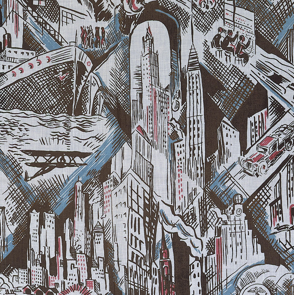
Block printed cotton by Ruth Reeves for WJ Sloane Ltd, New York, USA, about 1930. Museum no. T.57-1932

In China and Japan, Art Deco was also influenced. It was expressed through traditional materials. Their properties in Art Deco were: polished surfaces and colours such as the Chinese jade and Japanese Lacquer. They used geometric forms of East Asian.

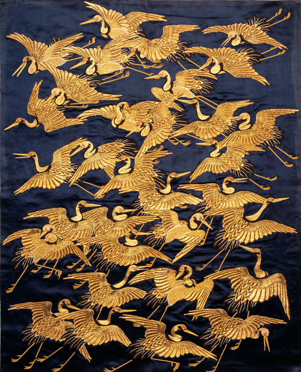
Silk fukusa (gift cover) embroidered with a flight of cranes, Japan, 1800-50, Edo period. Museum no. T.20-1923

Art Deco was also in Africa, which was provided with the richest sources. They had bold, abstract, geometric zigzags, hatch marks, circles and triangles of African textiles. Jean Lambert-Rucki and Pierre Legrain were two African artists who produced African-inspired sculpture and furniture.


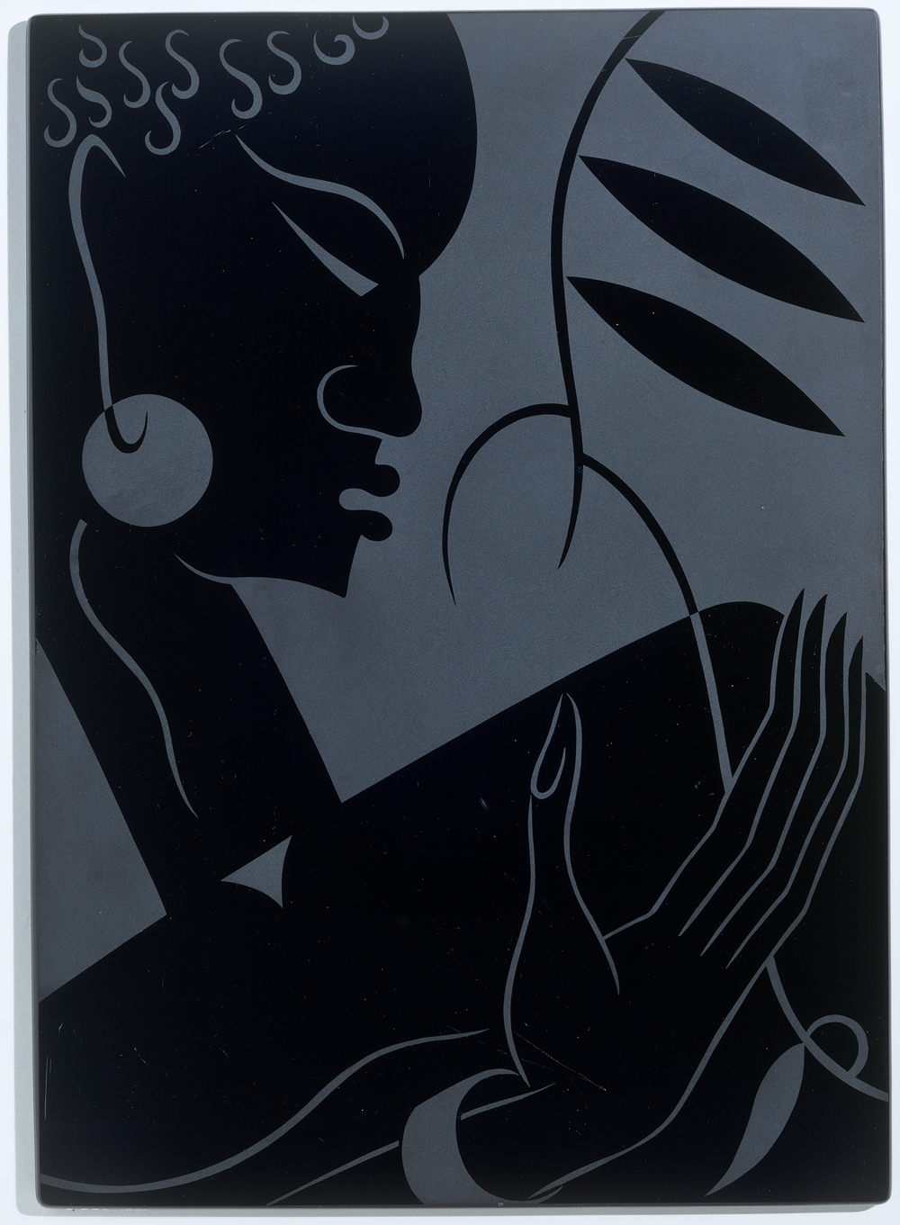
Sand-blasted glass panel by Sigmund Pollitzer for Pilkington Ltd, St Helens, Merseyside, UK, 1933-38. Museum no. C.230-1991


For example this Chrysler building which was built in 1928 was inspired from Art Deco. Art deco buildings which were from Art Deco usually had: Cubic forms, Ziggurat shapes: Terraced pyramid with each story smaller than the one below it,Complex groupings of rectangles or trapezoids, Bands of color, Zigzag designs, Strong sense of line and Illusion of pillars.


Art Deco designers used to draw on the art of Maya and Aztec to create different forms but North Americans and South Americans saw this particular art as something different than they used to do the


Europeans.


The image on the right top is from the film Great Gatsby because the film had Art Deco inspirations such as the clothes, building and era.


Art Deco's design were inspired from: Ancient Egyptian and Mayan civilizations, Tribal Art, Surrealism, Futurism, Neo-Classisism, Geometric Abstraction, Popular culture, Russian ballet companies and Modernists-Josef Hoffmann, Frank Lloyd and Adolf Loos.


Some of the materials that the Art Deco used were: Ivory, Enamel, Shagreen, Ebony and Mother of pearl.


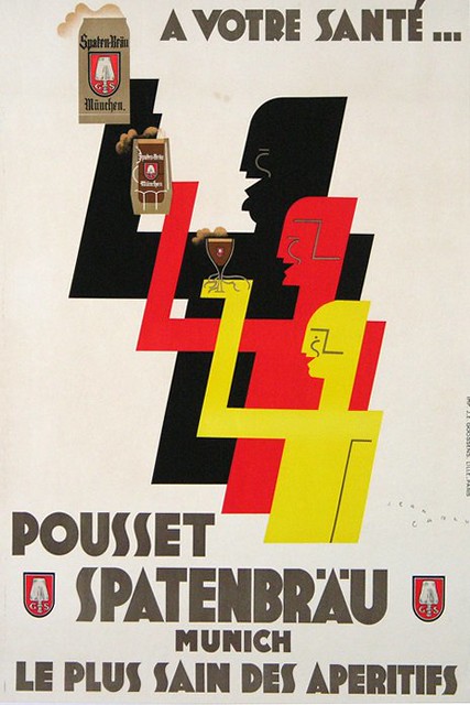
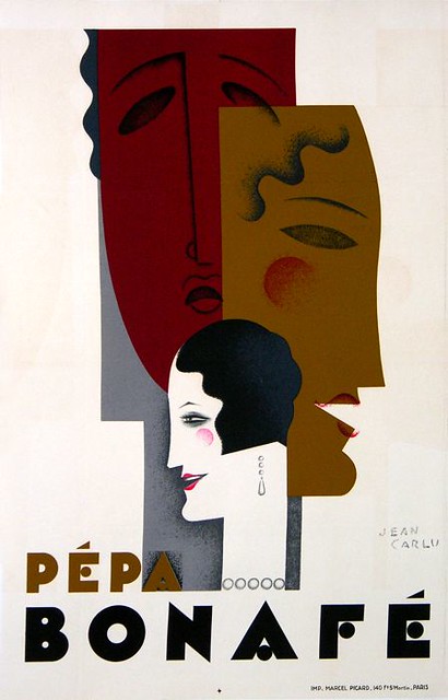
Jean Carlu

He was born in France in Bonnieres. He came from a family of architects. His early work was inspired from Cubism, as one can see from the geometric shapes that Picasso used to draw. He produced the latter in the US. In poster form, Cubism and Surrealism were under the influence of Andre Breton and Yves Tanguy. Some innovations were: The introduction of photomontage, the use of 3D elements in poster design and the use of electric lightbulbs in posters.


Bibliography:

Sunday, 19 October 2014

Art Nouveau


Art Nouveau


Art Nouveau began from the 1880's till the First World War and it was held in the Western Europe and US. The inspirations were from organic objects such as dragonflies, wings, sea and grass.

Art Nouveau was influenced by: nature, arts and crafts, rococo, celtic art, Japanese art, Egyptian art and gothic revival. Certain curves were inspired from deep sea creatures.

Art Nouveau has several names in different countries:
Britain and Glasgow - Art Nouveau
France- Art Nouveau or Modern Style
Vienna- Sezessionstil
Germany- Jugendstil
Italy- Stile Liberty
Spain- Modernista
America- part of the Arts and Crafts


The term itself Art nouveau first appeared in the Belgian Journal in the 1880's-L-Art Moderne. Post-Impressionism and Symbolism were related with Art Nouveau. Some influential graphic artists were Alphonse Mucha, Jules Chéret, and Henri de Toulouse-Lautrec.


Art Nouveau was meant to be beautiful while being affordable and having certain decoration.In the 1920's Art Nouveau lost its fashion because of Art Deco but then it regained it in the 1960's.

Jules Cheret

Jules Cheret was born in Paris in 1836 and died in 1982. He was a French painter and lithographer. He had a limited education because he and his family were poor. Painting led him to do an art course at the Ecole de Dessin.

While visiting various museums in Paris he studied some techniques of certain artists. Cheret left Paris because he wasn't happy with what he was doing and he hoped to find a job as an artist.

Cheret is known as the father of The Belle Epo
que poster where he inspired other painters for them to explore the genre. In 1890 he was awarded Legion d'Honneur also in 1928 his achievements in graphic art were honoured by the French government.


Camille Stéfani. Jules Cheret (1893)


In 1863 Angelo Mariani came up with the Vin Mariani. It became one of the most popular wines of all time. It was a mixture of booze and coke. The advertisements said that it would give you health, strength, energy and vitality.


He uses colours for illustrations and he experiments with typographic elements. The typography in this illustration is sans-serif and it looks as though it is hand-written. The background colours are dull while the pink is creating attention.


Eugene Grasset


He was born in 1841 in Lausanne. He studied architecture and polytechnical in Zurich. He did furniture design, book illustrations and posters. Grasset did many important works such as the stained glass windows in the cathedral at Orleans, the design of the facade of the Hôtel de Dumas in Paris and mosaics in Saint Etienne in Braire.


These examples above are the work of Eugene Grasset, they have some Japanese characteristics, such as the trees and flowers and the clothes that they are wearing. They look like certain works on the wood blocks.


This poster is from 1894, it was done by a thick black drawing locking forms into flat areas. As we can see in this image, Grasset used medieval clothing and he used touches of Japanese Art. He also made stained glasses, on fabric, typefaces and printers ornaments.


Bibliography:

Art Nouveau | Thematic Essay | Heilbrunn Timeline of Art History | The Metropolitan Museum of Art. 2014. Art Nouveau | Thematic Essay | Heilbrunn Timeline of Art History | The Metropolitan Museum of Art. [ONLINE] Available at: http://www.metmuseum.org/toah/hd/artn/hd_artn.htm. [Accessed 12 October 2014].

Jules Cheret - The complete works. 2014. Jules Cheret - The complete works. [ONLINE] Available at: http://www.jules-cheret.org/. [Accessed 13 October 2014].

Cheret.Info - The Life and Art of French Painter Jules Cheret. 2014. Cheret.Info - The Life and Art of French Painter Jules Cheret. [ONLINE] Available at: http://www.cheret.info/. [Accessed 15 October 2014].

Patent Medicines of Yesteryear | The Fix. 2014. Patent Medicines of Yesteryear | The Fix. [ONLINE] Available at: http://www.thefix.com/content/patent-medicines-yesteryear#slide6. [Accessed 15 October 2014].

Jules Cheret: French Poster Designer, Lithographer. 2014. Jules Cheret: French Poster Designer, Lithographer. [ONLINE] Available at: http://www.visual-arts-cork.com/famous-artists/jules-cheret.htm. [Accessed 15 October 2014].

Design History: Jules Cheret. 2014. Design History: Jules Cheret. [ONLINE] Available at: http://be-artsy.blogspot.com/p/jules-cheret.html. [Accessed 15 October 2014].

Eug￿ Samuel Grasset Biography - Infos - Art Market. 2014. Eug￿ Samuel Grasset Biography - Infos - Art Market. [ONLINE] Available at: http://www.eugene-grasset.com/. [Accessed 15 October 2014].

http://guity-novin.blogspot.com/2010/05/history-of-graphic-design-birth-of-art.html


Having a look at History of Graphic Design: Cheret and Grasset. 2014. Having a look at History of Graphic Design: Cheret and Grasset. [ONLINE] Available at: http://havingalookathistoryofgraphicdesign.blogspot.com/2012/06/cheret-and-grasset.html. [Accessed 19 October 2014].

Tuesday, 7 October 2014

What is Graphic Design?

What is Graphic Design?

The definition of Graphic Design is to communicate with people by using typography, illustration, photographs and printing. The first person to use the term Graphic Design was William Addison Diggins in 1922.

Every person can communicate in different ways such as texting, speaking, drawing, in sign language, signs and other people communicate through graphic design by posters, illustrations, manipulated photographs and advertisments. Certain works of Graphics are to inform, others are to advise people about something and to give opinion.

There are different types that one could use Graphic Design for:

Insignificant- Stamp design
                       Labels
                       Bus tickets and concert tickets
                       Billboards
                       Posters

Permanent-    Logos and brand names
                       Hotel signs and company signs

Signs and
sombols-        Translating pictures and/ or images into words and meaning

Pictogram-      Image representing an object/place/meaning creating a visual language.

Rebus-            Is a pictorial image representing a sound

Ideogram/
Phonogram-   A character or a symbol representing a whole idea

This is an example of a Graphic designer work:


Firmorama Graphic Design


A Graphic Designer uses certain programs to create these type of work such as Photoshop, Illustrator and InDesign.
Graphic Design goes back to the medieval times. They used to stamp on metal. Even in caves, people used to paint on them with certain tools or engrave.

There is the image based design which consists of images that represents defferent ideas that the graphic designer wants to communicate to us with information and emotions. In this case the image has to show all the information, it as to be clear to the target audience either way the graphic designer is not doing their work right. The images can be either painted, drawn, manipulated, taken primarily or graphically rendered. For example one can use clichés to interpret a message. If the graphic designer has an audience where they don't know that fire means danger for example he or she should do something different to communicate.

Then there is the type-based design which consists of a typography message. Graphic designers can send a message to the people by a certain text that would imply something they want to send.

There are 3 roles in graphic design: To identify, to inform and instruct and to present and promote.


Examples of logos, signs, rebus and abstract:


Who is Stefan Sagmeister?

Stefan Sagmeister was born in 1962 in Austria. He blends typography and imagery to create new, ambitious stuff. He is best known for his album covers for Talking Heads, Lou Reed, OK Go and The Rolling Stones.
The Sagmeister and Walsh company creates identities, commercials, websites, apps, films, books and objects for clients.


Sagmeister  is known for tricking the senses as in typography, exhibitions and environmental art. He disorientate the images and manipulate them in his own style which is also knowned as Style=Fart.


At the age of 15 years, Sagmeister started his very own unorthodox career for a magazine titled, 'Anthorn', but he later realized that working on the layout was more enjoyable than writing articles.


Aizone


This photo above is one of his magnificent works, he used typography on top of the woman shown and he used monochrome as colour scheme.


Aizone


This example has a dynamic effect where the words form: Embrace change. The colour purple is used for the words and the dress of the woman.


Bibliography:


AIGA | What is graphic design? . 2014. AIGA | What is graphic design? . [ONLINE] Available at: http://www.aiga.org/guide-whatisgraphicdesign/. [Accessed 05 October 2014].


Aizone - Work - Sagmeister & Walsh. 2014. Aizone - Work - Sagmeister & Walsh. [ONLINE] Available at: http://www.sagmeisterwalsh.com/work/project/aizone/. [Accessed 07 October 2014].

About Stefan Sagmeister | Stefan Sagmeister: The Happy Show. 2014. About Stefan Sagmeister | Stefan Sagmeister: The Happy Show. [ONLINE] Available at: http://thehappyshow.tumblr.com/Bio. [Accessed 07 October 2014].


AIGA | Stefan Sagmeister . 2014. AIGA | Stefan Sagmeister . [ONLINE] Available at: http://www.aiga.org/medalist-stefan-sagmeister/. [Accessed 07 October 2014].